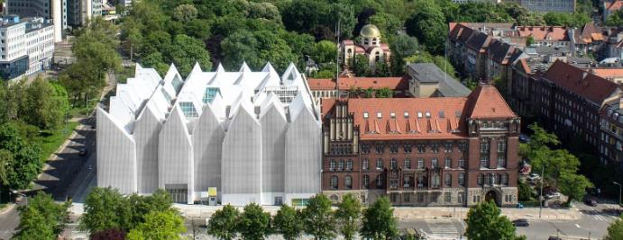
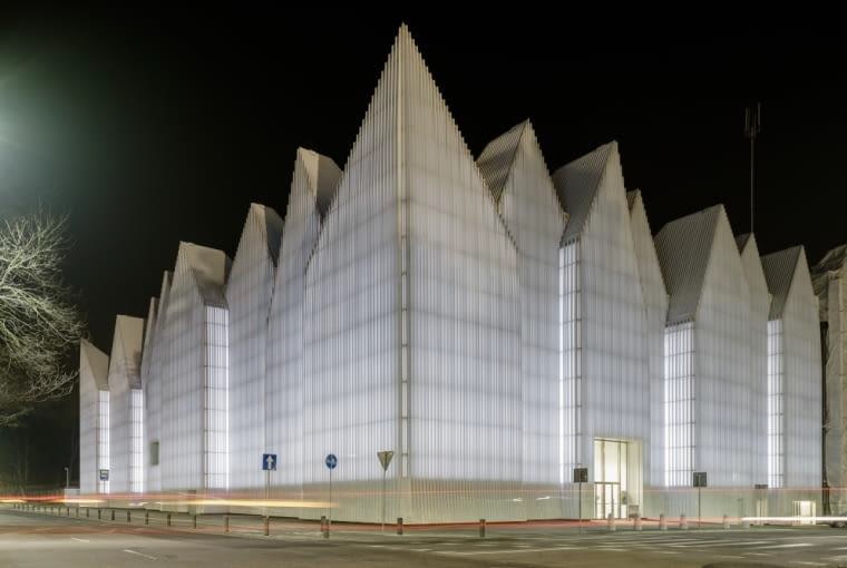
The Mieczysław Karłowicz Philharmonic in Szczecin is undoubtedly one of the most beautiful and characteristic examples of modern architecture in Poland. Its elegant, white form, awarded internationally, has become a symbol of the city and an icon of modern architecture. From the very beginning, the building impresses with both monumentality and the subtlety of its form.
Much like this bastion of grandeur in the heart of Szczecin, the institution's website should be a showcase worthy of this uniqueness. Unfortunately, the current design is quite the opposite.
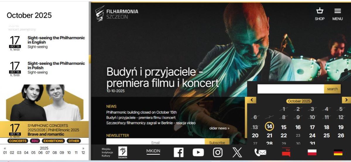
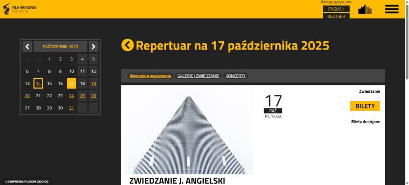
Information Overload and Chaos
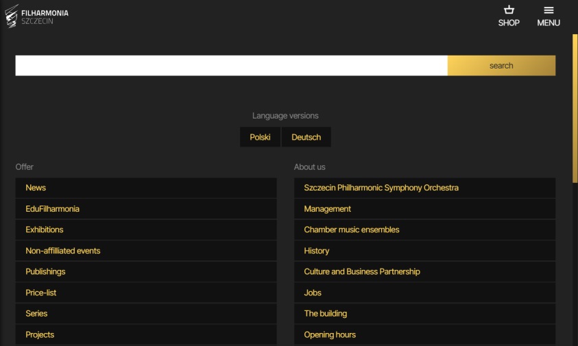
The first impression upon visiting the website is overwhelming. Instead of feeling lightness and space, the user is confronted with a flood of information, icons, calendars, and announcements. The site offers no breathing room; it does not guide the visitor clearly but bombards them immediately with content.
Lack of Architectural Coherence
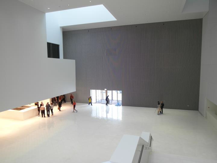
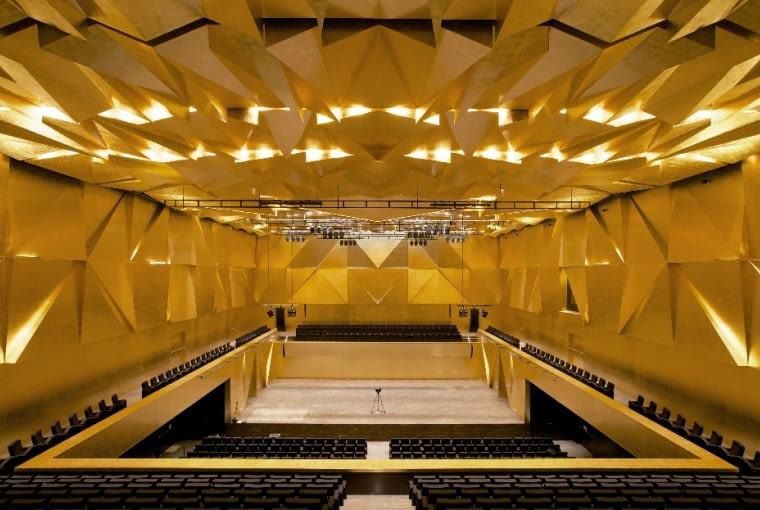
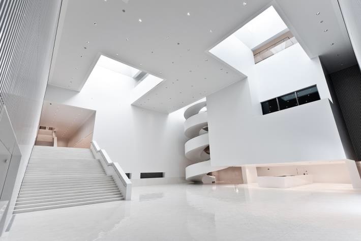
The Philharmonic's architecture is a play of contrasts—broad monumental stairs versus slender, ethereal spiral staircases. The white interiors convey a sense of space, coolness, and elegance, while the warm browns and golds of the concert hall add dignity and a special aura. It looks like a flawless path that leads the viewer to the Holy Grail: the concert hall!
But let's get back to the main hall. Upon taking the first step after entering, what catches the eye is my favorite architectural structure: the stairs. The broad classical stairs strike with brutal monumentality, while the delicate spiral stairs almost seem to float. This combination of weight and lightness, density and airiness, makes the building a unique work of art.
Meanwhile, the website does not leverage this potential. There is no sense of airiness or classical monumentality. Instead of coherence, visual heaviness and chaos prevail. The final effect resembles an overloaded information portal rather than an elegant showcase of one of Poland's most important music institutions.
Symbolism and Undervalued Elements
The stairs serve as a symbol—monumental and ethereal at the same time—and are the essence of the building's architecture. In the physical space, they guide visitors toward the experience of art, giving the passage almost a ritualistic meaning. On the website, this motif is entirely absent.
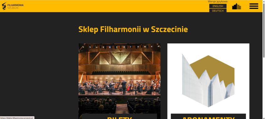
Furthermore, the Philharmonic's logo, which references the architectural form of the stairs, is pushed into the corner and stripped of meaning. Its potential is unused, neither serving as a starting point for visual identity nor as a graphic narrative element. This is a missed opportunity to build a unique online identity.
User Experience and Brand Perception
"The website does not play the same melody as the building". A personal experience highlights the contrast: first, awe at the architecture, then disappointment with the website. Instead of feeling that one is in a unique place, there is lingering displeasure and a reluctance to continue interacting. The site overwhelms rather than inspires. It does not encourage ticket purchases or exploration of the offer—it scares you away. For a cultural institution, this is a significant loss, as the first online contact shapes the brand perception in the visitor's mind.
Redesign Proposal
A new website design should draw inspiration directly from the building. The foundation should be white space—resulting in a light, clear, and uncluttered site where warm browns and gold serve as accents.
The layout could mimic a melody: fluid, coherent, and readable. Unlike physical structures, the web offers unlimited space, so there is no need to clutter the landing page. We should structure the page like a piece of music: a beginning (an introduction or "hello"), a middle (storytelling that leads us to buy a ticket), and an ending (a farewell until next time).
Specifically, instead of two calendars that assault the eyes immediately, there should be one dedicated page with clear information, a timetable, and, of course, a calendar. This approach gives the designer space to create a better user experience, which will surely help encourage the user to purchase tickets.
Next is the logo. It should be prominently centered as a symbol of the institution, perhaps as the main component on the landing page, and then used to accent subsequent pages. When looking at the logo, we can see dynamism thanks to its sharp, angular borders. This aesthetic can be integrated into the page design—for instance, through the shape of container boxes. Just as the concert hall design features plenty of non-flat layers, this approach would ensure a coherent digital design. Such a design would not only better reflect the character of the Philharmonic but also improve the user experience and encourage engagement.
Conclusion
"Architecture deserves a website as exceptional as the building itself".
The website should be an extension of the architecture—just as the building takes your breath away, the website should impress with lightness, simplicity, and elegance. The current design is the opposite: dark, confusing, and incoherent. A redesign is not optional; it is a necessary investment in culture, image, and the institution's future.
*Photos by: Agnieszka Rumińska, Dariusz Gorajski, George Meitner.


 (1).png)