An introduction to icons versus text
Selecting between text and icons for user interfaces is one of the most important choices made in professional app design. Text provides accuracy and clarity, but icons can simplify and improve the look of a product. Intuitive and efficient user experience depends on finding the ideal balance between these two approaches. In this article, we'll look at the benefits and downsides of using both text and icons, see how they might work together, and provide helpful advice on which option is ideal for your particular situation.
The Power of Icons: Space-Efficient and Intuitive
Modern user interface (UI) design has become largely dependent on icons. This rapid change is led by smartphones/watches/tablets where room is “everything”. However, as we all know, the design of this product must be wide open to the whole spectrum of people with their cultural and educational differences. Moreover, we cannot forget about another group of products: professional applications where space can often be limited and expectations of good design are very high. That's why designers are racing for the best icon design, which gives their product the significant benefit of the ability to communicate ideas quickly and with minimum screen space. I’d like to show you an example of the most well-known icon: magnifying glass.

I don’t need to tell you what it means, do I? Of course not! Anyone can understand it in no-time. This is a simple proof how good icon design works.
"Design is not just what it looks like and feels like. Design is how it works."
These are Steve Jobs’ words from 2003 about functionality and usability. Well-designed icons increase work efficiency by integrating form and function. This is particularly important in professional apps where users often need to perform tasks precise and without confusion. We should keep in mind that icons are becoming more complex as interfaces are intended for highly qualified specialists.
This easily leads to the conclusion that there are difficulties with icons. Not all icons are as widely recognized as the magnifying glass. Some may cause confusion because they are unclear or culturally distinctive. For example, the floppy disk icon used to represent "Save" may lose its meaning for younger users who have never seen a floppy disk in real life. This is a very simple example of a problem, but it shows one more important topic: there may be icons that are easily recognizable by one group but not by another. To guarantee that icons have meaning for every user, they must be tested and designed in a consistent manner through the app.
The Clarity of Text: Precision in Communication
Text is better where icons may fall. Text labels provide the precision and readability required for professional applications, especially those with complex specifications. For instance, icons might not be able to fully represent the complexity of each tool or function in an application designed (let say) for data analysis. Something like "Generate Report" as a label is far less confusing than an abstract symbol.
As Jakob Nielsen once pointed out,
“Clarity is job #1. You can't expect users to take time out of their day
to try to figure out what your icons mean.”
This clarity provided by labels helps reduce the learning curve of applications and guarantees that users can take actions they understand in complex environment. And this understanding is very important because it gives user a feeling of safety and... joy of work.
However, there may be difficulties if you only use text. Labels tend to overflow interface and gives feeling of being overwhelmed, especially on smaller screens. Moreover, texts as we all know, are understood only if read. If there are plenty of labels, buttons with text, headers, etc. Finding the right option may take some time. Additionally, text-based interfaces might lack the elegant, modern look that icons offer, which may not be crucial for professional applications but is certainly 'nice to have.'
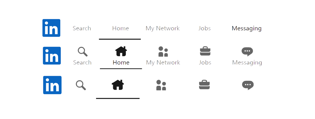
Icons and Text: The Best of Both Worlds
With the benefits and concerns of both text and icons, many designers decide to combine them together. This gives you the visual attractiveness and space-saving properties of icons, combined with the clarity of text labels. For example, in application one might put an icon for "Settings" (typically a cogwheel) next to the word "Settings". This gives additional meaning to the symbol and helps users to learn its functionality after over time.
Text and icon combinations work particularly well in applications that target to a wide range of users with different levels of environment knowledge. Novice users see the text labels, while experienced users can navigate quickly with looking to the icons. An interface created like that can be used simultaneously by experts and newbies.
Practical Tips for Designers
A few things should be taken into account by designers when choosing between using text, icons, or both. In the first place, answer the questions, “who is the audience of the app” and “what they expect from it”. Keep in mind that an icon-only UI could work well for a highly technical audience which is familiar to the industry standard iconography. Consider adding text-labels for the icons if it could be beneficial/helpful for less experienced users.
But remember one of the most know sentence about design by Dieter Rams:
"Good design is as little design as possible"
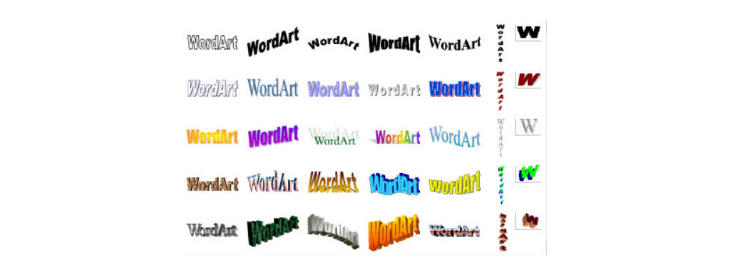
Unfortunately, Microsoft Word devs did not know Rams' books, which is why (or thanks to) such things as WordArt were created. Do you remember WordArt in MS Word (let's say between 1997 and 2003)? Yup, this was a crazy time to live in.
Adding too much (text, icons, colours) is a killer for design. It may look good for you. You may even create a good argument in your head why this is important and necessary, but... only for you. Remember to test or discuss your design with as many colleagues as possible to get proper feedback. By experimenting with different approaches, you can find the one that offers the best balance between usability and functionality.
Summary
Choosing between text and icons impacts the app from start to finish. Effectiveness, usability and aesthetics depends on this decision. While words help to clarify things and reduce learning curves - icons look better, take less available space. By merging both solutions, you can design an app that is pleasing to the eye and easy to use.
References
"Icons vs Copy. Visual Perception in UI" - Design4Users: Read more here
"UX Best Practices: Include Labels with Icons" - Voice+Code: Read more here
"Icon vs. Icon with Text vs. Just Text" - UX Pickle: Read more here
"Icons and UX Web Design — A Usability Rundown" - The Creative Momentum: Read more here
Smashing Magazine: Go to main page
Grafmag: PL Przejdz do strony głównej


